Automated Data Plotter
This application dynamically generates many types of graphs derived from various IEM data sources. Feel free to use these generated graphics in whatever way you wish.
1 Select a Chart Type
2 Configure Chart Options
Plot Description:
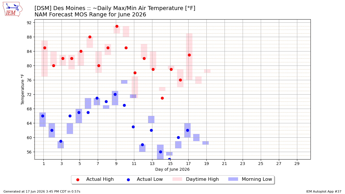
This chart displays the combination of Model Output Statistics (MOS) forecasts and actual observations by the automated station the MOS forecast is for.The case of ~Daily Max/Min Air Temperature is difficult to explain. The NBS/NBE values are slightly different periods than the GFS/NAM values. Some care is taken to attempt to properly align the MOS values to the observations and consider METAR 6-hour max/min temperatures when appropriate.
The bars represent the ensemble of previously made forecasts valid for the given time.
The IEM MOS Mainpage has more details and services for this dataset.
3 Generated Chart
Based on recent timings, plot generation averages 2 seconds. Please wait while your chart is being generated...
IEM Daily Features using this plot
The IEM Daily Features found on this website often utilize plots found on this application. Here is a listing of features referencing this plot type.
- 03 Oct 2025: Forecasted Cool Down
- 20 Dec 2023: NBE MOS Forecast
- 20 Feb 2023: Finishing out February
- 19 Oct 2021: MOS Dew Point Forecasts
- 19 Feb 2020: How's the GFS MOS doing?
- 10 Jul 2018: GFS MOS
- 11 Oct 2016: MOS Forecasting
- 08 Dec 2014: December Forecasts
- 25 Apr 2014: MOS Forecasts
- 03 Dec 2013: Forecast Ranges
- 16 Sep 2011: Missing MOS
- 16 Dec 2010: Computers aren't perfect